When TV Guide Controlled the Week
The physical guide, the local listings, the famous covers, and the surprisingly important job of knowing what was actually on tonight.
A familiar cover, a local channel key, and an entire household’s evening tucked inside a small weekly magazine.
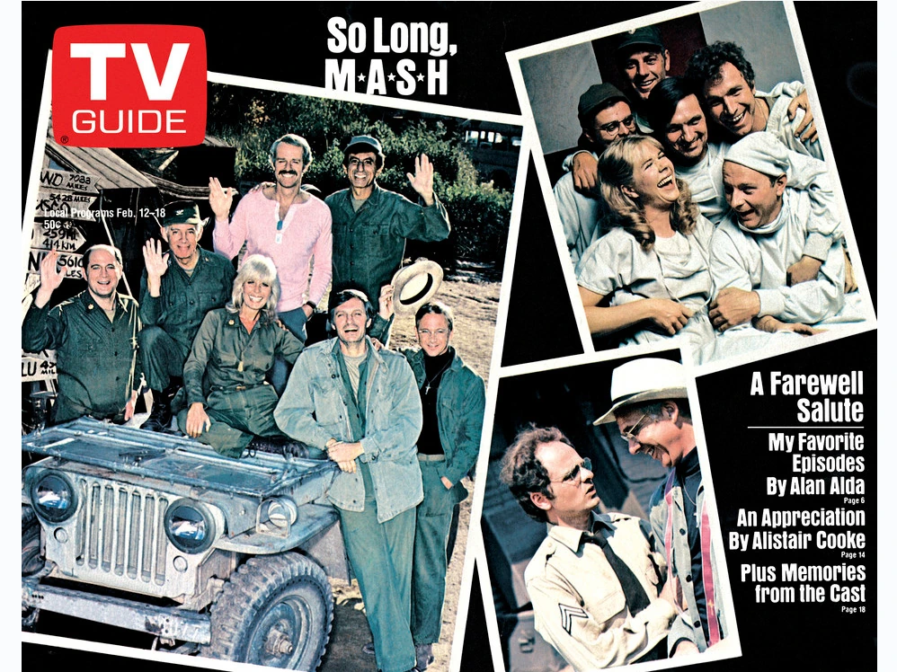
Somebody had the TV Guide, which meant somebody else couldn’t find the TV Guide. The program was about to start, a movie was supposed to be on, and the one person who had recently looked at the little magazine could remember everything about the cover except the information the room currently needed.
It might be beside the good chair, folded backward to a particular day. It might be underneath something on the coffee table. In a less cooperative household, it might be with the person who had taken it into another room and decided that the rest of the family could wait for the schedule to return.
Someone would insist that it was right there, as though repeating the location could move it out from under the newspaper. The people looking for it generally needed a more helpful contribution.
Before a television offered an on-screen description of almost anything you selected, that small weekly magazine did a remarkable amount of work. It identified choices, explained channels, supplied stories, promoted stars, and gave somebody a defensible answer to the question of what was actually on tonight.
TV Guide didn’t run every eighties home. Newspaper listings, station announcements, memory, and simply turning on the set had their own places. But in homes that used it, the magazine could become a surprisingly important household object for something that was going to be out of date next Saturday.
Inside This Article
- A little magazine could claim a large part of the table
- First, make sure you have this week’s week
- The cover traveled farther than the listings inside
- The channel key was the part you learned without celebrating it
- The log rewarded knowing where to put your thumb
- A grid made the collision easier to see
- A few lines could sell a whole evening
- Finding out it was a repeat could change the vote
- One Atlanta issue shows how much lived behind the cover
- The movie listings could produce a household campaign
- Sports made the timetable a useful prediction
- The cover told you which stars belonged in the room
- Dallas could sit on the table between broadcasts
- A sitcom family could borrow the coffee table too
- The magazine sold the look as well as the plot
- A group portrait could feel like company arriving early
- A television partnership could acquire a second stage
- Miss Piggy didn’t need the remote to take over
- The cover wasn’t always a photograph
- You could open it for a time and stay for an article
- The critic hadn’t been given control of your remote
- A paid invitation wasn’t the same as a listing
- A pencil could turn a printed schedule into a proposal
- More channels gave the paper more work
- A recorder gave the listings a new deadline
- The magazine could be right when tonight was different
- The next issue had to get into the house somehow
- Last week’s plan became next year’s time capsule
- A few questions before someone folds the page
A little magazine could claim a large part of the table
That little TV Guide never needed much real estate to run the household. It lived on the coffee table, under a newspaper, or wedged beside the chair of the person most likely to choose tonight’s program. By Wednesday the cover was curling, one page had a suspicious fold, and somebody was insisting the listings had been there a minute ago. All that authority in something barely bigger than a paperback.
Its usefulness encouraged a particular kind of wear. It was opened repeatedly rather than read once in sequence. The current day acquired a folded page. A cover could curl. A subscriber’s address label or a crease from being carried around gave the object a life quite different from the clean cover image preserved in a retrospective gallery.
That mattered because the magazine was being used, not merely admired. Someone could read the features at one time and consult the listings at another. The same issue might pass between people who had almost no interest in the same shows.
Its smallness was practical. You could hold it in one hand, carry it to another room, or turn it toward someone as proof that the movie really did begin at the time you had been saying for the last ten minutes.
For all the elaborate programming elsewhere in the television business, the immediate household decision could depend on finding a particular paper object beneath a completely unrelated piece of mail. The networks had expensive promotional campaigns. The family had a table, and the table was not organized according to anyone’s promotional plan.
First, make sure you have this week’s week
A familiar cover could be reassuring right up to the moment it turned out to belong to the wrong issue. The magazine was a schedule for a defined stretch of days, not a permanent promise that a favorite would always appear wherever you remembered seeing it.
The dates therefore did real work. An older copy could still be interesting, but it was no longer a reliable way to discover tonight’s selection. A movie description remained inviting after the broadcast had passed, which was an especially annoying way to learn that it had passed.
The issue could also be read ahead. A person wasn’t restricted to the evening currently on the screen. Saturday, Tuesday, and Friday could all be inspected before any of them arrived, allowing a small amount of entertainment ambition to accumulate around the next several days.
That anticipation is one reason the old covers still feel like markers of time. The face on the front wasn’t only a performer you recognized. It was the performer occupying the household’s guide during one particular week, with its own school days, weather, visitors, and arguments about the television.
Collectors now preserve those objects long after their practical expiration. The household originally using them had a more immediate standard. The interesting old issue was fine, but where had somebody put the one that could tell us whether tonight’s episode was a rerun?
The cover traveled farther than the listings inside
TV Guide combined a national entertainment identity with listings intended for a particular area. A familiar star on the cover didn’t mean the practical information inside would be identical in another city.
Stations, channel numbers, reception areas, and cable systems gave the listings a local job. A guide acquired while visiting relatives could look comfortably familiar and still require a different understanding of where a program would appear.
The distinction wasn’t a minor inconvenience added by later collectors. TV Guide was expanding its regional editions during the period. A July 1980 business report describes additional editions arriving that summer. The publication had reasons to keep making its national brand more locally useful.
For the reader, the relevant question wasn’t how impressive that system looked as a publishing enterprise. It was whether the numbers on the page corresponded to the channels the household could receive. A beautiful description of an unavailable movie was not much comfort.
That is also why an authentic cover cannot establish a particular local lineup by itself. The cover tells us which issue and entertainment story the publisher was promoting. To reconstruct a family’s actual choices, we need the edition and the pages that did the scheduling work behind it.
The channel key was the part you learned without celebrating it
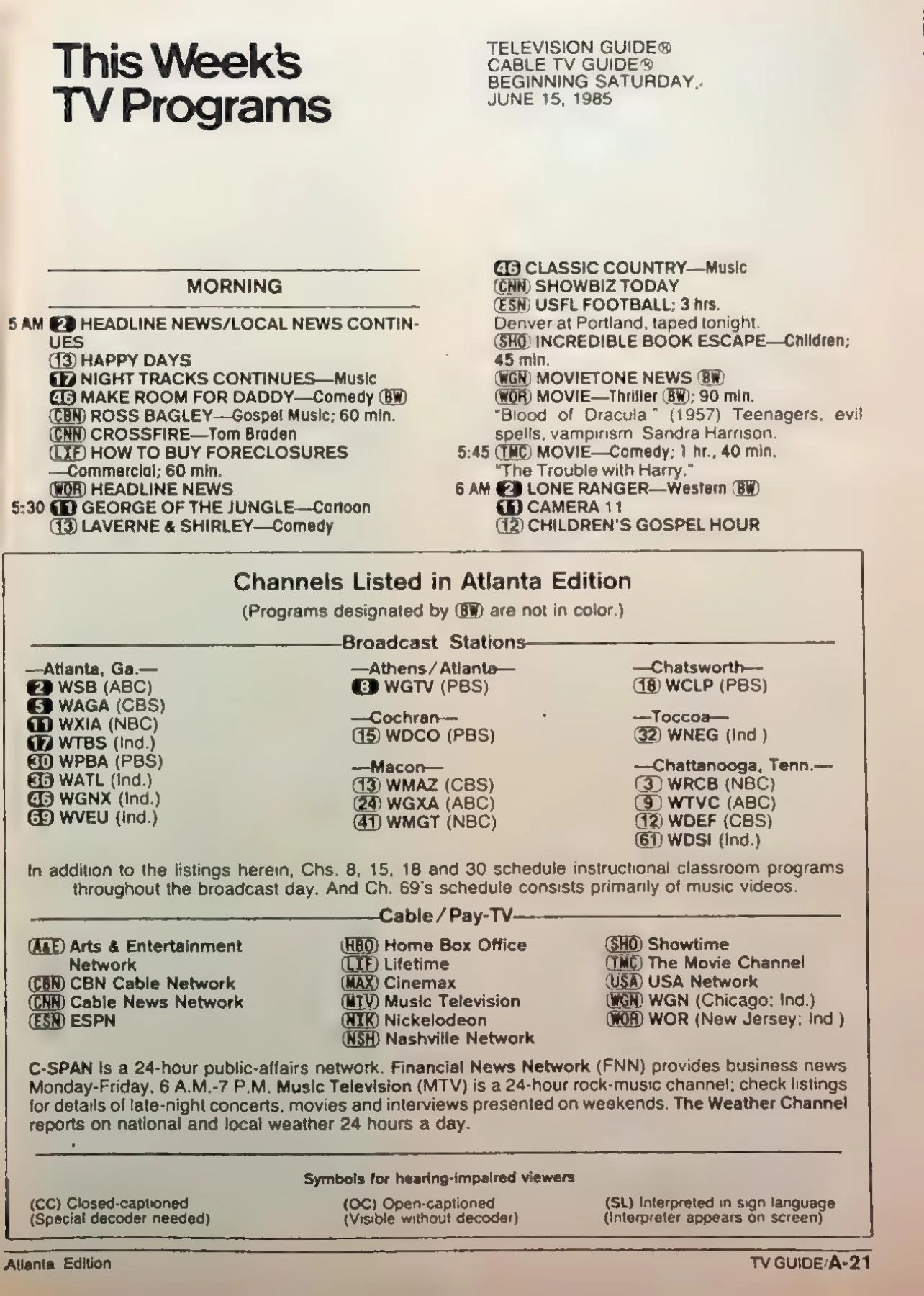
The channel key was the code you learned without realizing you were studying. The guide said one thing, the dial said another, and your local stations had their own numbers and call letters. After enough evenings, you could translate the little symbols at a glance. Before that, you hollered across the room for somebody who knew whether the mystery program was on 5, 11, or a UHF station that required some coaxing.
At first, a child might need help with that code. After enough evenings, the familiar identifiers could be recognized almost as automatically as the channel numbers on the set. The magazine had taught a practical skill without anyone announcing that a lesson had begun.
A local station’s network affiliation didn’t remove the need for the key. NBC was not one universal channel number, and a syndicated program might appear on a station someone associated with a completely different part of the day.
The page could also include stations beyond a household’s reliable reception. A reader had to know which printed possibilities were useful at home. The guide was a map, and the antenna or cable subscription supplied the part about which roads you could actually take.
That small translation between page and picture became so familiar that it is easy to forget it existed. Nobody was amazed each evening that a number, a station, a time, and a title could be combined into a plan. They simply wanted the person holding the magazine to read the right line.
The log rewarded knowing where to put your thumb
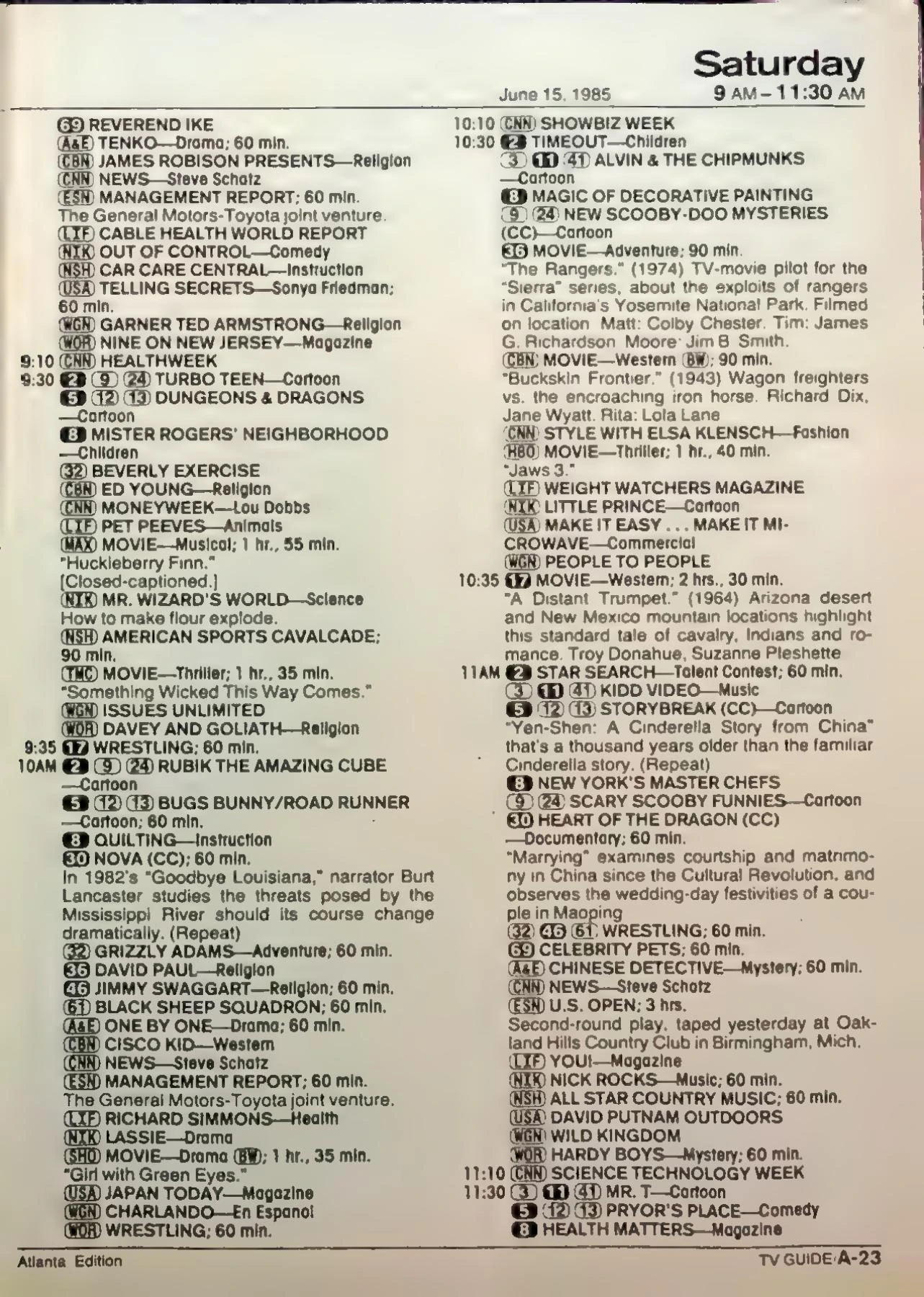
You learned to read that listings column with one finger holding your place. Find Thursday. Slide down to eight o’clock. Look for the thing everybody had agreed to watch, then check whether anything better was hiding on the next channel. If there was a conflict, the guide didn’t solve it. It simply delivered the bad news in very small type.
The arrangement made television look less like an endless collection and more like a sequence of decisions. Several programs occupied the same hour. A movie crossed a boundary another show observed. A sports broadcast could claim a much larger part of the afternoon than a half-hour description nearby suggested.
Short entries didn’t always receive equal attention. A familiar title could be recognized instantly; an unfamiliar one might need the synopsis to become appealing. A guest star, subject, or description could make a person stop moving down the column.
The reader also developed habits. Someone looked first for movies. Someone checked a favorite serial. Someone inspected an evening before committing to watch anything at all. It was possible for two people to use the same pages and notice entirely different programs.
The skill wasn’t glamorous, but it offered a satisfying kind of competence. You knew what was available, where to find it, and whether the household’s confident announcement about tonight was based on an actual listing or merely on what had happened last week.
A grid made the collision easier to see
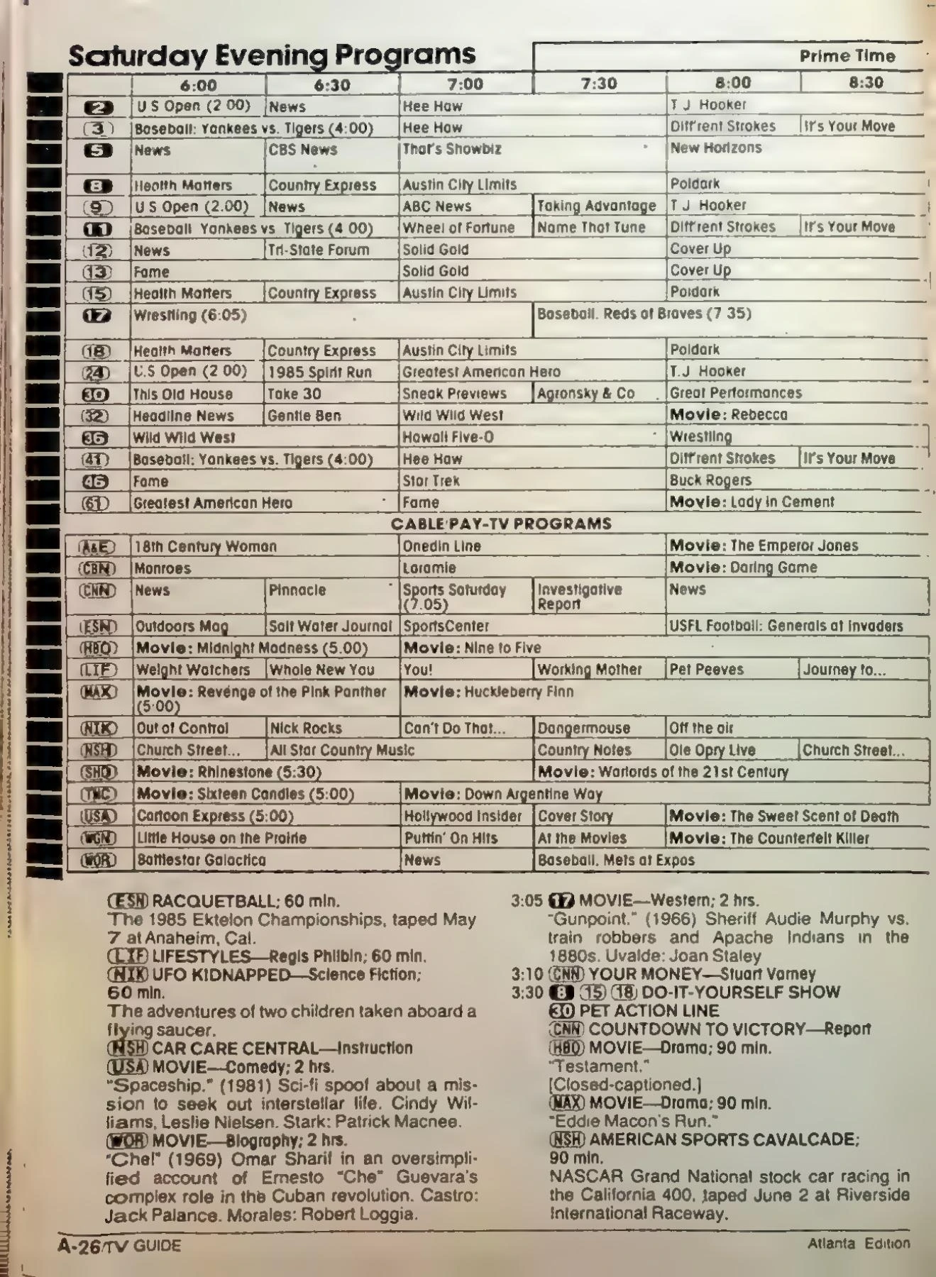
A schedule arranged across time could show the evening’s conflict at a glance. Programs lined up beside one another, and the viewer could see how one choice would overlap another before committing to it.
That overview did a different job from a description. The grid helped answer when and where. The log or accompanying text could explain why something might be worth watching. A person trying to organize an evening could move between those kinds of information instead of expecting one small box to do everything.
It also made the schedule’s shape visible. A string of short comedies looked different from a film occupying a long stretch. An event could interrupt the pattern a viewer had expected. The evening was a piece of available time with competing claims already drawn onto it.
Different editions and dates need to be inspected on their own terms. It would be a mistake to take one surviving page and declare that every eighties issue, cable system, and local market displayed the information in exactly that way. The useful memory is the act of comparison, not a claim that every page was fixed forever.
That comparison could end with a compromise nobody particularly loved. The printed grid had made the problem legible. It hadn’t promised to settle which sibling deserved the better half hour.
A few lines could sell a whole evening
A few cramped lines in TV Guide could sell an entire evening. One sentence promised a special guest star, a mysterious disappearance, or a movie monster loose in somebody’s hometown. That was sometimes all the promotion a program needed. Somebody would tap the listing with a finger and say, ‘We’re watching this,’ as though the decision had already been approved by the entire family.
That could make a synopsis surprisingly powerful. An interesting guest, an unusual predicament, a holiday story, or a movie premise could turn a program from background possibility into the thing someone wanted the family to watch.
The description could also create a private version of the episode before it aired. A child imagined what the situation would look like. An adult recognized an actor’s name. By the time the program began, someone already had expectations assembled from a very small amount of print.
Sometimes the promise was better than the result. A plot that sounded irresistible in miniature could become an ordinary hour when expanded into scenes. The magazine had not made the program; it had offered a reason to try it.
That is part of the pleasure of looking at old listings now. The tiny invitation still works on the imagination even when the broadcast date has long passed. You can understand why someone would have marked the page and announced that this was the one they didn’t intend to miss.
Finding out it was a repeat could change the vote
A familiar program wasn’t always a new episode. Knowing what story was scheduled could therefore matter almost as much as knowing the title. The guide could prevent a household from arranging an evening around something it had already watched.
A repeat wasn’t automatically bad news. It might be an episode missed earlier, a favorite worth seeing again, or comfortable company while another task continued. Someone who had missed it could regard the return as a valuable second chance, while another viewer considered the same listing permission to demand a different channel.
The difference could be surprisingly personal. A person remembered the episode’s ending and was satisfied. Another remembered a performance they wanted to watch again. The magazine could supply the information without supplying agreement about what the information ought to mean.
It also kept a long-running series from existing only as a vague weekly appointment. A description connected tonight’s broadcast to a particular story. The program was familiar; the question was which visit to its world the station had selected.
For someone without a recording, a personal copy, or another immediate way to see it, that distinction had practical consequences. The old episode wasn’t simply sitting on a shelf waiting to be chosen. Its return to the schedule was the opportunity.
One Atlanta issue shows how much lived behind the cover
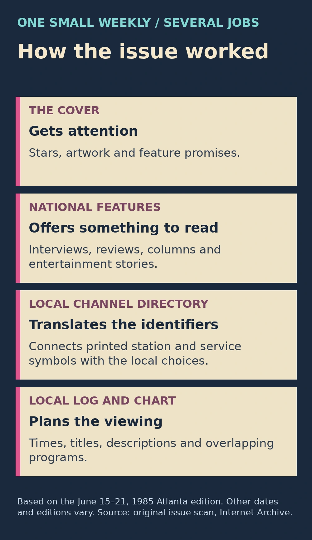
The surviving June 15–21, 1985 Atlanta edition makes the magazine’s double life wonderfully tangible. Its national features and local program section sit inside one weekly object, with a channel directory, daily listings, and an evening chart doing different parts of the planning.
Those pages are not a universal American lineup. They are evidence of how this particular edition organized the choices it expected its readers to encounter. A household elsewhere would have needed its own local map.
Look at the change in visual rhythm. An entertainment feature can invite you to linger over a photograph and a story. A directory wants to be consulted. A schedule wants to help you find one relevant time without reading every other hour on the page.
That mixture explains the magazine’s unusual wear pattern. The handsome cover and features could attract attention, while the functional pages received the repeated handling. The most useful part of an issue wasn’t necessarily the part someone would later frame.
The object also makes an important distinction between history and memory. A reader may remember how the guide was folded or who used it first. The surviving edition can establish what its own page actually printed. Both kinds of information help recreate the evening, provided we don’t ask either one to prove something it can’t.
The movie listings could produce a household campaign
A movie listing turned an ordinary evening into a sales pitch. The person lobbying for the film read the cast aloud, added whatever they knew about the plot, and hoped nobody checked how late it ended. A sibling preferred the sitcom on the next channel. An adult wanted the news. There it all was, in print: the whole argument scheduled in advance.
The guide supplied material for that pitch. A recognized actor could persuade an adult. A premise could persuade a child. A person who had seen it before might provide an enthusiastic recommendation, followed immediately by a warning from the others not to tell the ending.
Details mattered because a film could occupy the time belonging to several shorter programs. Choosing it meant accepting what would be missed elsewhere. A movie beginning late also introduced the possibility that the person most enthusiastic about the choice would fall asleep before the final act.
The print description created a version of the film in advance. You pictured the situation, decided whether the genre sounded promising, and imagined how exciting the evening might become. Sometimes that imagined movie was better than the one on the screen. The person who had promoted it then spent an awkward amount of time insisting that it was about to improve.
That is a different sort of discovery from searching for a film already known by name. The magazine put an unfamiliar possibility in front of a reader at the moment it was going to be available. An ordinary consultation about tonight could become the first encounter with a favorite.
Sports made the timetable a useful prediction
A sports listing could claim an afternoon or evening, and the person who wanted it often regarded that claim as obvious. Somebody else in the house might have a different opinion about whether the entire event needed to be watched from the opening commentary onward.
The guide helped establish the planned broadcast. It couldn’t promise that live events would behave as neatly as the boxes on the page. A game that ran long could affect whatever followed, leaving a viewer waiting for a favorite program to begin while another part of the room regarded the delay as the most interesting television of the day.
There were also time-zone and station questions. A reader had to use the information intended for the relevant area, rather than assume that a time seen somewhere else described the household’s own broadcast.
The resulting argument could sound absurdly technical for a family disagreeing about a television. Someone consulted the magazine. Someone listened to the announcer. Someone insisted that the following show must be starting now because it always started now.
Printed planning was still useful. It simply operated in a world where weather, live events, news, and station decisions could intervene. The page was a plan for the broadcast, not an order the outside world had agreed to obey.
The cover told you which stars belonged in the room
Before the practical pages did their work, the cover made an invitation of its own. A familiar performer looked out from the table. The magazine could give a star a different sort of visit from the weekly role: a portrait, a pairing, a costume, or a group arranged for a single memorable image.
That cover didn’t necessarily endorse the household’s preferred program as the best show on television. It showed what the publication had chosen to put forward that week. A star could attract attention, while a cover line offered another story to the reader who wasn’t interested in the main face.
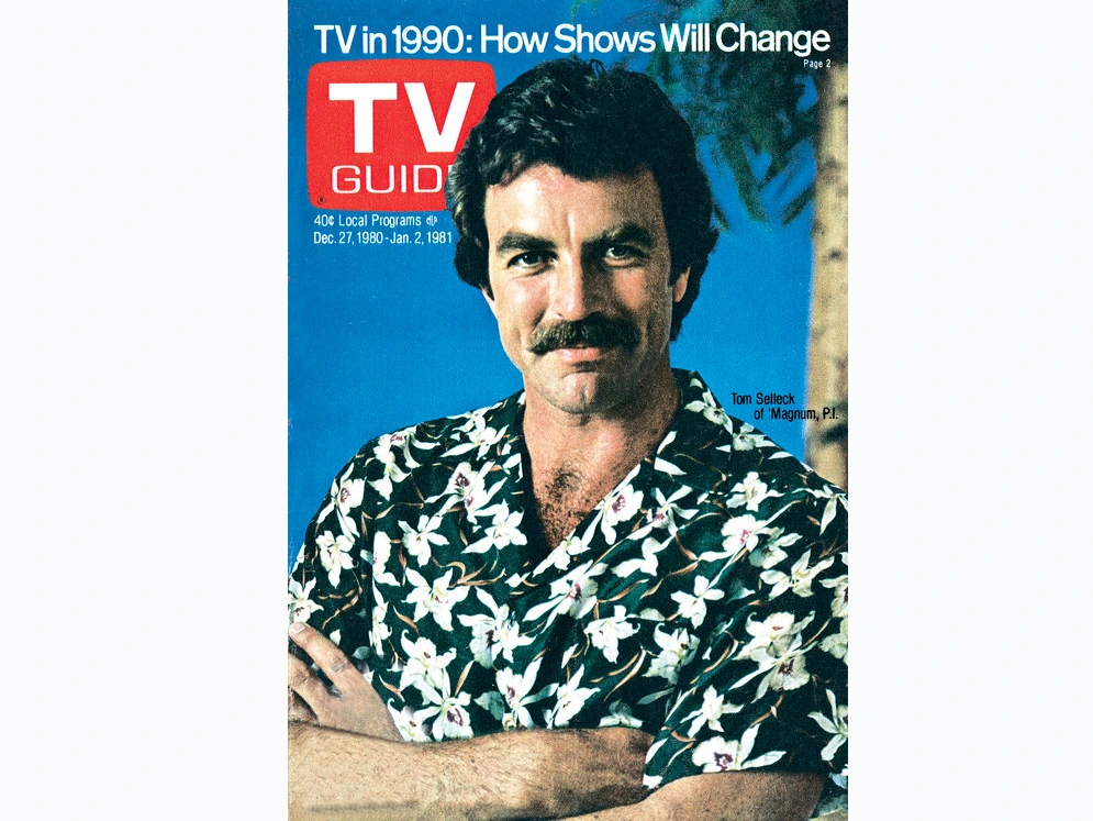
The range is part of the fun. Tom Selleck on a December 1980 issue, Miss Piggy on an August 1981 cover, and the women of Dynasty in October 1982 make very different invitations. The red title makes them members of the same weekly family.
In a household, the effect could be delightfully uneven. One reader wanted the article attached to the main picture. Another wanted the listings. A child could recognize a face without knowing the series well, building a little map of television celebrity from magazines left within reach.
That makes the covers useful historical images, but they aren’t the whole magazine. An album of them preserves the attention-getting front door. Behind that door were the local pages that helped someone decide which channel the evening would actually occupy.
Dallas could sit on the table between broadcasts
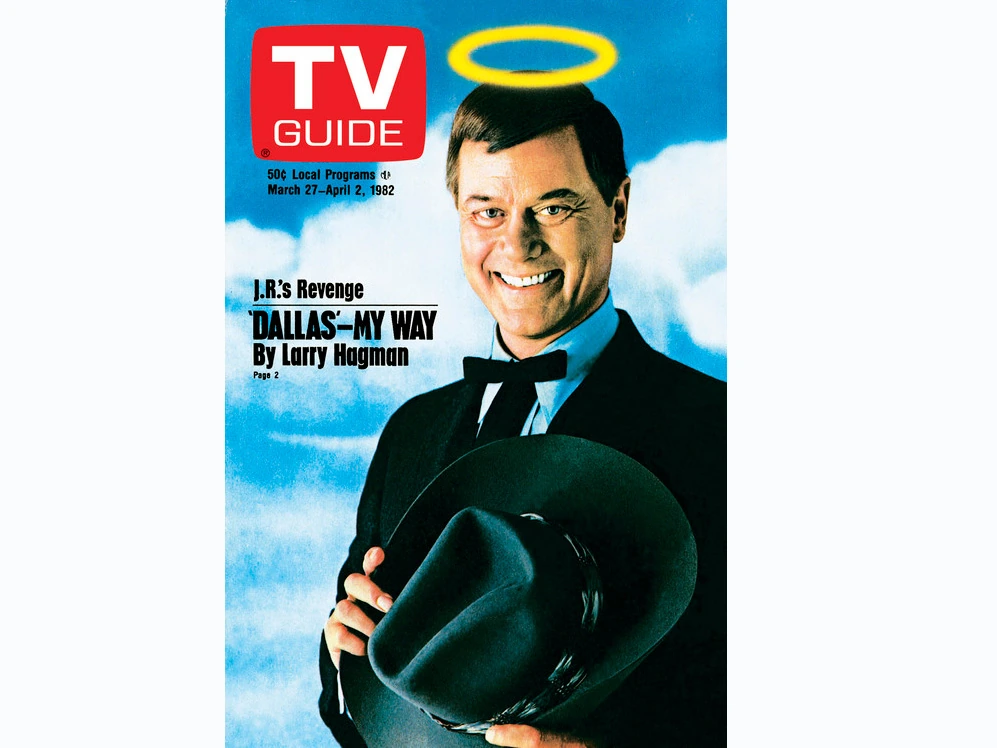
The March 27, 1982 cover puts Larry Hagman in front of the reader before the set is even on, complete with an illustrated halo above J.R.’s head. His character’s world could occupy the household as a printed image between visits to Southfork, while the joke on the cover invited a second look.
The issue belongs to the 1981–82 television season. The season reference helps place the magazine beside the year’s broadcast competition without turning the cover itself into a ratings result. Being chosen for a cover and receiving a particular Nielsen rank are separate things.
For someone following Dallas and its feuding Ewing household, a feature could extend the weekly relationship. The actor became a subject as well as a character, and the reader could carry an impression of the performer back to the next episode.
That extension worked particularly well for a serial whose relationships already encouraged discussion between broadcasts. The magazine didn’t have to supply the next chapter to keep the program present. A portrait and a promise of a story gave the audience another reason to think about it.
It also illustrates how the guide crossed interests inside a family. Someone who didn’t watch the serial could still become thoroughly familiar with its stars because they kept appearing in the room on something the whole household needed.
A sitcom family could borrow the coffee table too
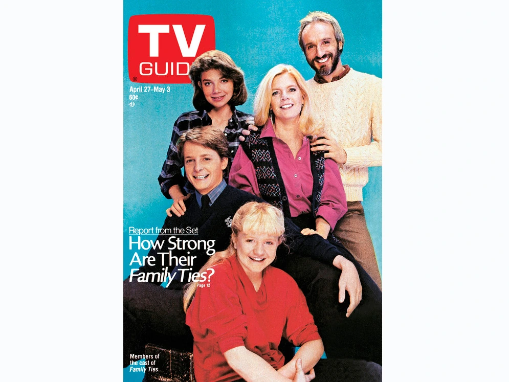
That April 27, 1985 Family Ties cover made the Keatons temporary members of the coffee-table clutter. Their faces were already familiar from the set, but now you had a portrait you could inspect while waiting for the next episode. If the issue stayed around long enough, it collected the kind of bent corners a magazine never shows in a collector’s photograph.
That issue falls in the 1984–85 television season. A reader encountering the Keatons there was seeing a program in the middle of its eighties life, not a retrospective account assembled after the run was over.
Family Ties brought a family into the weekly schedule. The magazine could make the people playing that family available in another form, encouraging recognition even among readers whose own favorite was on another network.
That was part of the publication’s reach inside the home. A person could begin by checking the time of a show and end by reading about another one. The features were available alongside the functional information, ready to catch a reader who had opened the magazine for an entirely different reason.
The movement between the two feels particularly characteristic of a shared paper object. Nobody had to seek out an article through a separate device. It was there in the issue somebody else had brought home, between the cover and the pages you needed for tonight.
The magazine sold the look as well as the plot
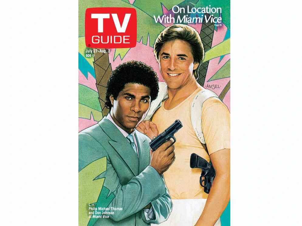
Miami Vice’s July 27, 1985 cover could communicate an atmosphere before a synopsis entered the discussion. Clothes, faces, pose, and color carried information of their own. You didn’t need a long plot description to recognize that this was a different television invitation from an older courtroom hero in a conservative suit.
The appeal of Miami Vice reached beyond the weekly case. A magazine portrait could isolate the performers’ style and put it where somebody who hadn’t watched the episode would still notice it.
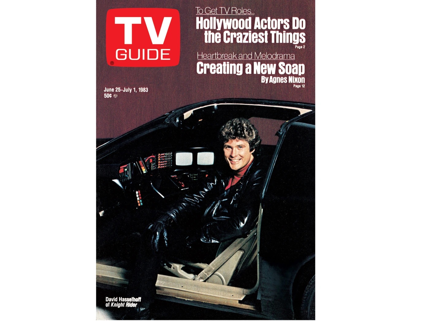
Other covers made similar use of an immediately recognizable visual world. Knight Rider could bring a man and a car to the front of the guide. The A-Team could offer a different group of familiar faces. The magazine’s practical identity stayed constant while the pictured television changed its wardrobe.
That gave the object something to do even when it was closed. A listing only helped a person who opened the right page. A strong cover could occupy the table all week, repeatedly reminding the room which stars had received this particular piece of attention.
It is easy to see why those images survive so vividly. A program’s title sequence moved past at its own pace. The printed image remained available to look at again, including during whatever show the rest of the family had chosen.
A group portrait could feel like company arriving early
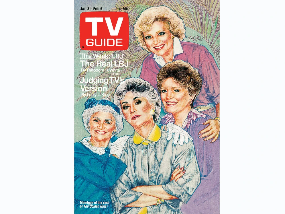
On the January 31, 1987 Golden Girls cover, the four women arrived early for their weekly visit. You didn’t need an episode synopsis to know the pleasure they promised. The picture was enough to remind you who would be trading insults, dodging Dorothy’s glare, and eventually finding their way back to the kitchen.
The Golden Girls made a shared home into a television destination. On the magazine, the performers could become familiar visitors to an actual home as well, sitting in sight whenever someone reached for the schedule.
That relationship to an ensemble differs from the way a lone star can dominate a cover. The attraction includes the combination: faces recognized together, a sense of different personalities, the expectation that a scene will become funnier when somebody else enters it.
A viewer could also look ahead without the next episode being present. The cover stood between broadcasts, offering recognition rather than resolution. It helped a favorite remain part of the household’s week while the network was busy showing something else.
Among eighties sitcoms, that sense of continuing company was a powerful reason to return. The magazine didn’t create the relationship. It supplied another place for it to appear, small enough to be passed from one chair to the next.
A television partnership could acquire a second stage
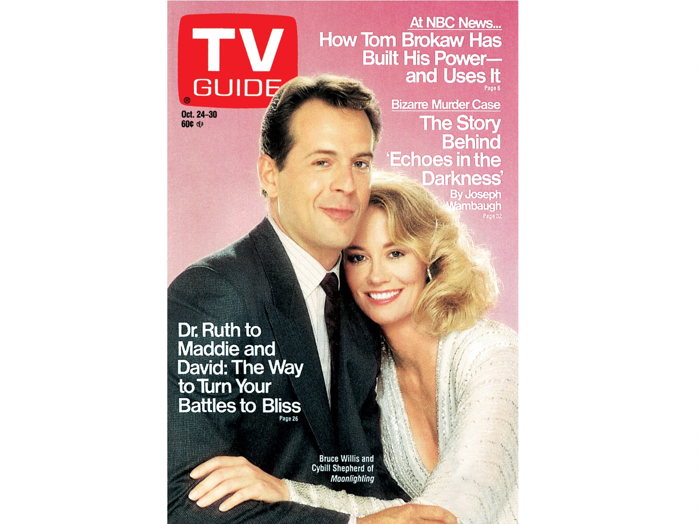
The October 24, 1987 Moonlighting cover puts Bruce Willis and Cybill Shepherd into a deliberately arranged magazine image. Their on-screen partnership had a life in the weekly schedule; the cover gave that pairing another place to be examined.
For someone following Moonlighting, a feature could feed interest between episodes without being another episode. The reader was encountering the performers through the magazine’s presentation, not simply watching Maddie and David continue their work.
That distinction could be enjoyable and confusing. A star’s interview, a character’s behavior, and a promotional portrait could sit close together in a fan’s imagination. The magazine offered access to the people making television while still packaging them for an audience eager to keep looking.
The cover also had to work for someone who didn’t follow the series closely. A striking pairing could make the reader curious enough to turn a page. The publication wasn’t only serving the established fan; it was placing an invitation in front of the person who had merely come to check Saturday’s movie.
That is the little guide’s unusual combination again: practical enough to be needed, attractive enough to encourage browsing, and familiar enough that a picture could become part of the room before anyone consciously decided to read the story.
Miss Piggy didn’t need the remote to take over
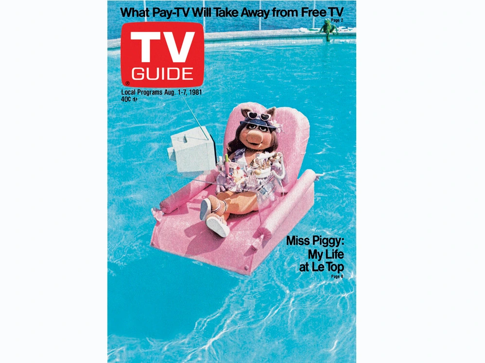
The August 1, 1981 cover gives Miss Piggy a bright pink floating chair and an expanse of blue water. It is a wonderfully confident way for a pig to spend the week on the coffee table. No one looking for a murder mystery had requested her presence, but there she was, receiving the magazine’s main attention anyway.
The image shows how a cover could be playful without giving up the publication’s practical identity. Behind the theatrical visitor were the times and titles somebody needed. The outside could make a person smile while the inside continued doing the serious business of deciding which family member would be disappointed at eight o’clock.
It also allowed a child to have an interest in the object before becoming especially skilled at reading a dense program log. A recognized character could attract attention first. The mechanics of finding a channel could be learned later, usually with considerable help from the person already holding the good chair.
The contrast is part of what makes these issues more engaging than a plain schedule. A publication can be useful and have a personality. The cover supplied an encounter; the listings supplied a plan. Miss Piggy had no obligation to make those two jobs look equally modest.
Decades later, the image remains inviting even after every schedule behind it has expired. It doesn’t have to prove a ratings record, represent every household, or explain the whole Muppet story. It is one real cover from one particular week, making the guide look like something worth picking up.
The cover wasn’t always a photograph
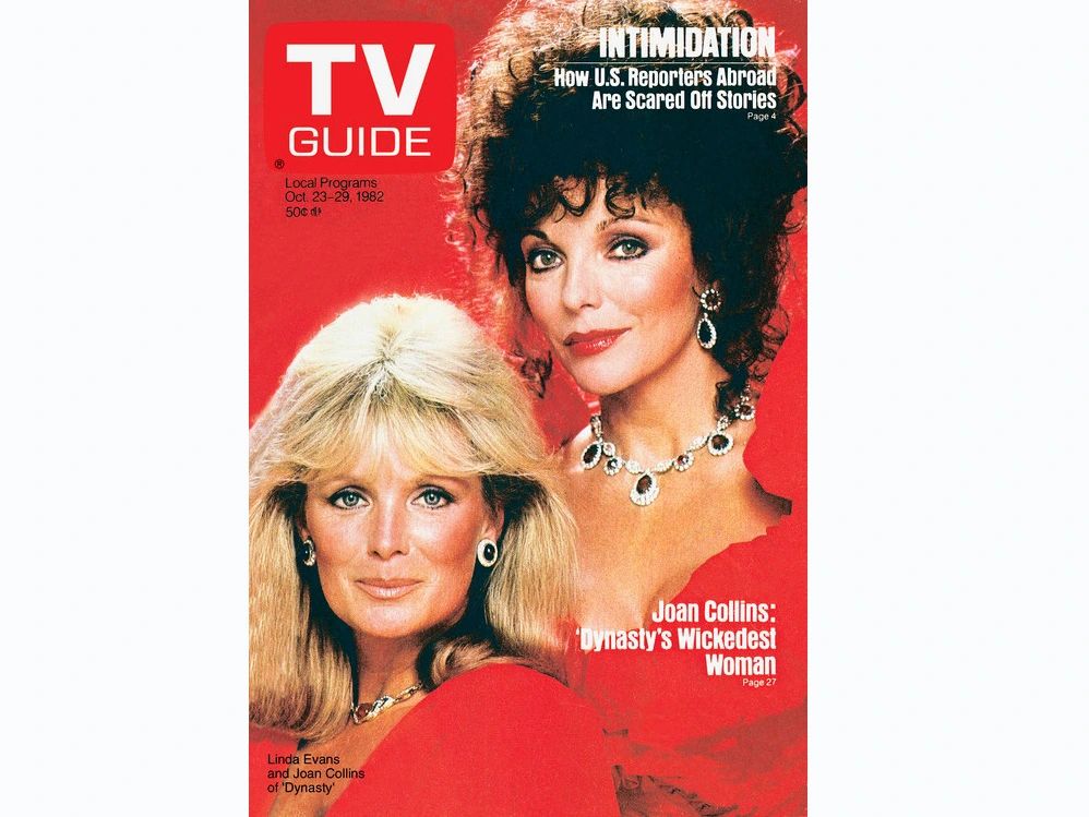
A good illustration could make a television face familiar in a completely different way. The Dynasty, Miami Vice, and Golden Girls covers shown here are archival cover artwork, not documentary photographs of the performers standing together at the instant depicted.
That distinction matters, and it doesn’t make the images less authentic as magazine artifacts. An artist could gather personalities, exaggerate a recognizable quality, or arrange a group with a freedom a straightforward portrait didn’t have. The result was the publisher’s original printed presentation, part of how the audience encountered television that week.
Other covers used photographs or a montage. The February 1983 M*A*S*H farewell gatefold brought a departing ensemble into a larger printed space. The magazine could make an occasion feel substantial before the reader reached any practical listing.
Put those images together and the decade looks less uniform than a simple collection of publicity headshots. Television was being interpreted as well as advertised. The small magazine could become a place for a different visual personality from the one moving across the screen.
When an old cover catches your attention now, it is worth looking at what kind of image it is. A photograph, a drawing, and a montage can all preserve a real piece of publishing history. They tell different stories about the people pictured and the way the magazine wanted the reader to see them.
You could open it for a time and stay for an article
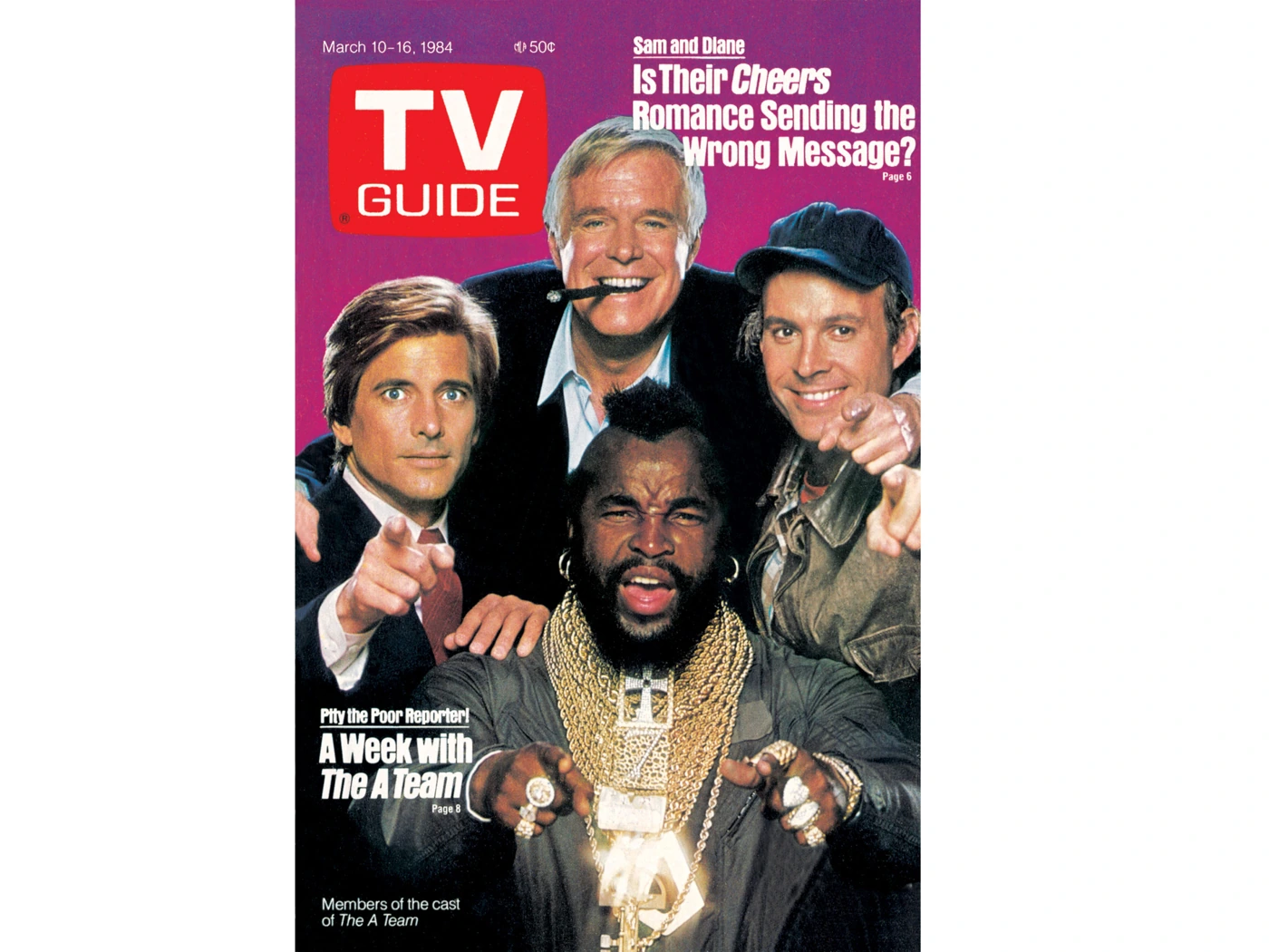
The listings gave the magazine a recurring practical purpose, but they didn’t account for everything a reader could find there. Features, interviews, commentary, and reviews offered reasons to keep turning pages after the evening had been planned.
That made casual discovery easy. A reader wasn’t always choosing an article in advance. The magazine was already in hand, and an interesting subject could interrupt the original task. Someone might finish reading before remembering that another person was still waiting to hear when the film started.
A feature could also complicate what a viewer thought they knew. Actors had work lives beyond the character. A program had writers, producers, production decisions, and disagreements the broadcast itself didn’t stop to explain. The magazine could let a regular audience look at the business surrounding its familiar entertainment.
The experience was social in a very paper-specific way. You could pass the issue across the room and point to the item you meant. The other person could read the same thing without needing a separate account, screen, or carefully dictated search phrase.
That wasn’t necessarily a peaceful exchange. Handing somebody an article could become a request that they agree with your opinion of the program. The fact that the magazine had printed it didn’t make the family obliged to find your favorite more impressive.
The critic hadn’t been given control of your remote
A review offered an opinion where a listing chiefly offered information. The two could occupy the same issue without doing the same job. Knowing a program’s time didn’t require agreeing that it was worth watching.
A reader could enjoy the critic’s voice, become annoyed by a judgment, or use a favorable assessment as evidence in an existing household dispute. A negative opinion of a beloved show could produce the familiar feeling that the writer had somehow watched the wrong version of your evening.
That disagreement was part of reading entertainment criticism rather than a failure of it. A critic might notice structure, performance, or a tired premise. A viewer might value a character, a familiar routine, or the fact that the family enjoyed watching together. Those weren’t always the same standards.
The magazine gave the argument another participant, one who could be quoted without being present to defend the remark. Somebody could point to a paragraph and suggest that this settled the matter. It seldom settled as much as the person pointing hoped.
A practical guide could therefore become an opinionated companion. It helped the reader find television and offered thoughts about what the reader found there. The choice to leave the set on remained with the people in the room.
A paid invitation wasn’t the same as a listing
The advertisements had to compete with the very reason you opened the guide in the first place. You were hunting a start time; a glossy ad wanted you to notice a new show, an appliance, or something available by mail. Sometimes the pitch worked. Most of the time, the reader kept a finger on Thursday at eight and flipped past it.
An advertisement could be larger and more emphatic than a nearby listing. A network wanted an event to seem urgent. A product wanted the reader to imagine it at home. The magazine’s practical authority and an advertiser’s persuasive purpose existed inside the same covers, but they weren’t interchangeable.
That distinction is especially useful when looking at an old issue now. A promotion tells us what someone wanted to sell or draw an audience toward. A listing tells us what that edition expected a station to show. Neither automatically proves how many people watched or what those viewers thought.
The ads also preserve a surrounding world. Products, prices, design, and assumptions about the reader can be as conspicuous as the entertainment being promoted. Some remain charming; others make clear how much public attitudes and advertising practices have changed.
A household didn’t need to analyze any of that to use the guide. The pages could simply be turned. Years later, the material beside the listings becomes another reason the old issue feels so firmly attached to its time.
A pencil could turn a printed schedule into a proposal
Marking a program was a way to make a private intention visible. A circle, underline, folded corner, or handwritten reminder could say that someone had noticed this broadcast and wanted the rest of the household to notice it too.
It wasn’t a universal ritual. Some readers kept the guide clean. Others remembered the time without writing anything. But a marked copy could become a small record of competing interests, especially when the people using it wanted different things in the same hour.
The mark also carried an optimistic assumption: that the plan would survive until the broadcast. Dinner might run late. A visitor could arrive. Somebody else’s choice could win. The pencil had not obtained authority over the household merely by landing on the page.
For a collector, genuine marks can be fascinating because they preserve use rather than just publication. They show that somebody interacted with the object. They don’t, by themselves, tell us who made the choice, whether it was honored, or how the evening turned out.
That uncertainty is part of the attraction. A surviving issue can retain a tiny trace of a plan while the people and circumstances behind it remain out of reach. The old guide knew what was supposed to be on. It didn’t record every reason somebody missed it.
More channels gave the paper more work
Cable complicated a planner’s job by adding choices that weren’t simply another local broadcast station. A household’s subscription and service lineup became part of understanding which entries mattered.
The June 1985 Atlanta pages make that expansion visible alongside the broadcast information. They contain cable identifiers and a pay-movie section, evidence of a magazine organizing several kinds of television rather than pretending the major commercial networks exhausted the evening.
For the reader, the challenge was familiar: identify what the house actually received, find the relevant program, and avoid getting excited about something available only through a service nobody had bought.
The arrival of cable in an eighties household therefore changed the guide as well as the set. A reader who knew the old dial could have new names and identifiers to learn. More choice had brought more planning, not automatically less.
That pressure helps explain the little magazine’s density. It was trying to fit a great deal of practical information into a portable object. The reader wanted clear choices; the television business kept finding ways to supply additional ones.
A recorder gave the listings a new deadline
With a VCR, a listing could become instructions for a recording rather than an appointment to sit in front of the set. The viewer still needed the right program, station, date, and time. They were now arranging for a machine to receive it on their behalf.
That could make a small error especially discouraging. Confuse a time or channel and the household might discover the mistake only when it settled down to watch the tape. The guide could be consulted again, this time during an investigation nobody particularly enjoyed.
A correct listing didn’t guarantee a correct recording. The equipment had its own requirements, and the household had to supply a tape and the necessary setup. The magazine’s contribution remained the schedule, not a promise that the person programming the machine had followed it.
Recording television on VHS made those distinctions part of ordinary life. The show could be moved to a more convenient hour, but the original broadcast still supplied a deadline somebody had to prepare for.
It is another reason the printed information mattered. A recorder offered a new kind of freedom, and the weekly guide could help arrange it. The family still needed to locate the issue before anyone could begin arguing confidently about which button had caused the problem.
The magazine could be right when tonight was different
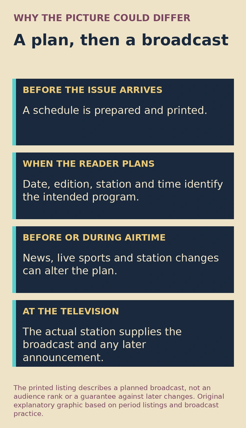
A printed issue had been assembled before the evening it described. That delay was unavoidable and easy to forget when the title on the screen failed to match the title somebody had carefully found on the page.
Breaking news, a live event, a station’s decision, or another schedule change could make the guide’s expectation obsolete. A reader could follow the correct line in the correct edition and still encounter something else.
That didn’t make the whole enterprise useless. Most planning involves expectations rather than control over the world. The guide reduced uncertainty; it couldn’t abolish it. The station’s announcements and the actual picture supplied information the already printed copy could no longer update.
For a disappointed viewer, the distinction could be less consoling than it sounds. You had arranged the evening, found the program, and claimed a chair. The schedule’s explanation of why it wasn’t legally obliged to cooperate was not the answer you wanted.
Those failures also belong to the experience of watching television in the eighties. The room’s relationship to the program included the plan, the anticipation, and the occasional moment when the plan had to be folded shut.
The next issue had to get into the house somehow
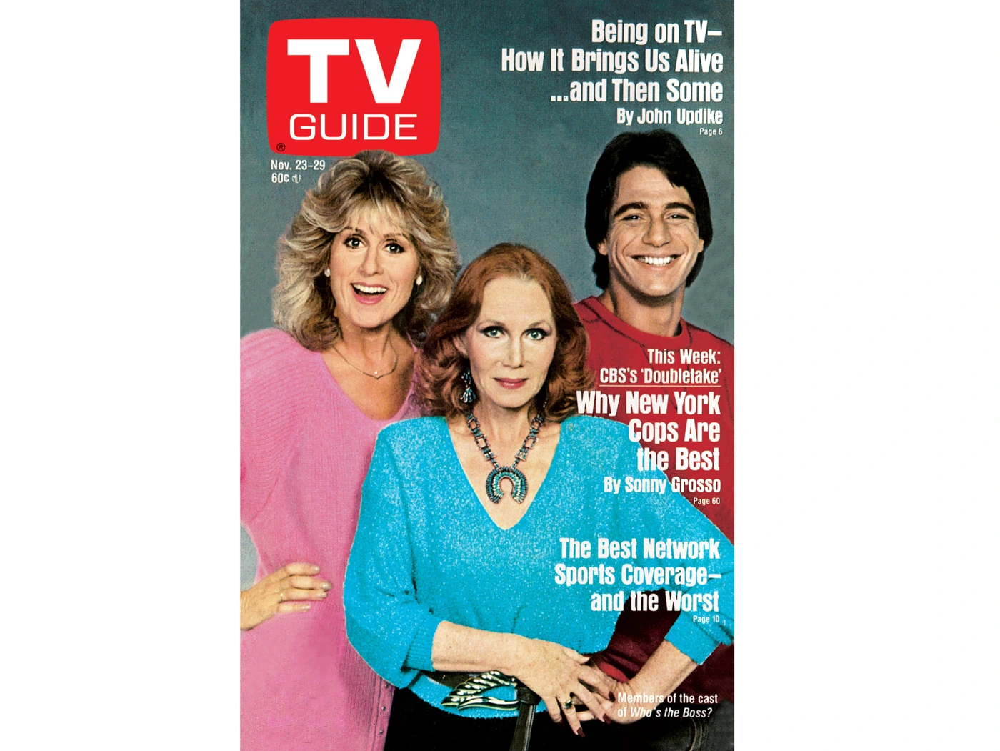
A household guide had a supply chain much less glamorous than the stars pictured on it. Somebody subscribed, bought a copy, brought one home, or decided that the newspaper’s listings were sufficient this week. The useful object didn’t replenish itself just because the family had begun relying on it.
A subscriber could associate the new issue with the mail. Someone buying a single copy could notice the cover while doing ordinary shopping. The decision might be practical, prompted by the coming week’s television, or entirely personal: a favorite performer had received the front, and the copy was coming home whether the rest of the room needed it or not.
That difference changed the object’s status. A regularly consulted guide could be handled casually. A copy bought for a particular cover might receive special instructions about folding, writing, or setting a glass on it. The person who wanted it preserved had to explain that preference to people who mainly wanted to know the movie time.
There could also be a gap. The new week arrived, the old copy remained, and somebody discovered too late that no one had acquired its replacement. The house still had a television. It had lost the particular way it was accustomed to planning television.
Other households never depended on the magazine in the first place. They consulted a newspaper, heard a station announcement, or knew their favorite’s regular slot. A childhood without a weekly TV Guide wasn’t an incomplete version of the decade.
The magazine’s power was local in that personal sense too. It mattered where people had made a habit of using it. Once it had become part of the routine, its absence could make a perfectly ordinary evening feel underprepared, as though somebody had invited the whole family to dinner and forgotten to put anything on the table.
Last week’s plan became next year’s time capsule

Once the week ended, the guide’s practical value changed sharply. A family could keep it, discard it, lose it under the next issue, or preserve it because the cover pictured somebody important to a person in the house.
What became outdated as instructions could become valuable as evidence. A surviving edition preserves a particular map of possible viewing. The cover preserves a publishing decision. The features and ads preserve assumptions about the audience being addressed.
The August 20, 1988 cover’s attention to TV and technology is especially fitting when looking back. A magazine helping readers navigate television could also put the changing means of receiving entertainment on its own front page. The guide was part of that changing home, even while it remained a small paper object.
Within the world of eighties prime-time soaps, sitcoms, mysteries, and other programs, TV Guide supplied a shared place to look. Its readers didn’t all want the same show. The object was useful precisely because their interests differed.
Browse an old issue and the temptation returns almost immediately. Something looks good. You check the time. Then you remember that the broadcast was several decades ago, and for one brief moment the little magazine has managed to make you late again.
A few questions before someone folds the page
Did the same TV Guide work everywhere?
No. The familiar national cover and features were paired with local program information. Edition, stations, channel identifiers, and cable availability mattered. A cover by itself doesn’t establish the schedule inside a particular local copy.
Was TV Guide only a set of listings?
No. It also offered features, interviews, reviews, columns, and advertising. Someone could consult a time, read about a performer, and compare an opinion in the same issue. That mixture helped the magazine become a household object rather than a disposable timetable alone.
Does appearing on the cover prove a program was number one?
No. A cover is an editorial and promotional choice. Audience rank needs separate ratings evidence tied to the correct season or broadcast. An attractive old cover should not be turned into a Nielsen result it never claimed to provide.
Why didn’t the television always match the printed guide?
Printing happened before the broadcasts. News, live events, and station schedule changes could intervene. A correct issue and edition provided a strong plan for the week’s television, but the actual station could supply a later change the paper could not incorporate.
Sources & Further Reading
- Publisher’s original cover archive
- Publisher retrospective: twenty eighties covers
- June 15–21, 1985 Atlanta edition, original scan
- Contemporary report on additional regional editions, July 1980